Make your PRR platform responsive
Bazaarvoice understands the need for websites to serve all users regardless of the device (desktop, tablet, or mobile) they’re using.
The design services team can apply a limited form of responsive design to your PRR platform.
What is responsive design?
“Responsive web design means that a website should respond to the device it’s being viewed on. The user experience should be steamless …as the user switches from their laptop to their tablet or smart phone. In broad terms, a responsive website should automatically switch to accommodate for device resolution, image size, and orientation.”
Assess client readiness for responsive design
Adding responsive design to an existing PRR implementation may involve technical complexities or complex integration issues on your site that would prevent us from implementing it easily.
The following steps will help us to successfully check your implementation to make sure that it’s ready for responsive design.
Step 1: Access to your website
- Bazaarvoice will need access to the environment where you would like the responsive design to be implemented:
- Staging if it’s a redesign
- Production if implementing on the current design
- Bazaarvoice will need access to a mobile device or a mobile simulator, such as browser developer tools or iOS Simulator.
Step 2: Assess readiness
The design services team follow this process:
- They’ll load your product display page (PDP) into a mobile environment.
- They’ll check for responsiveness. For example, the design should fit within a mobile viewport, without a horizontal scrollbar.
- The page will be optimized for mobile display.
- The team will verify that the source code contains Bazaarvoice code with reviews displaying on the page.
- They’ll test the review submission process.
Breakpoint media queries
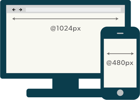
“Media queries are snippets of code that can be used to check the width and orientation of a device.”
The design team uses media queries to alter the page’s styling to accommodate how your PRR implementation will display on different devices.
For example, using media queries, an iPhone screen can be set to display a different set of colors and font sizes than a larger tablet display.